Three platforms, one interaction model
323K fans followed the tournament in 3D on Quest, mobile and web, through one interaction system. One feature failed, and the data said exactly why.
- Role
- Lead XR Interaction Designer
- Timeline
- 2025 & 2026 tournaments
- Clients
- ESPN & USTA
- Partners
- Meta, IBM, Immersiv.io
- Platforms
- Quest / iOS & Android / Web
The brief
Headset first was the wrong starting point
Asked
Design the richest experience on Quest, then port it down to mobile and web.
Built
The interaction model was designed for the weakest input surface first, then enriched upward. Quest was the headline. The phone was the reality.
À compléter — la preuve qui justifie le recadrage
Le chiffre de répartition des utilisateurs par plateforme (ex. « 78 % des sessions sur mobile et web »). C'est lui qui transforme une intuition en décision. Sans lui, ce bloc reste une opinion.
Success criteria
What we were trying to move
- Adoption Share of Live Scores users who open the 3D Match Center
- Depth Interactions per session, across all three platforms
- Return Fans coming back for the next match, not just the first
À compléter — seuils et point de départ
Chaque critère gagne un seuil chiffré (« +X % », « > N interactions ») et sa valeur 2024 si elle existe. Si ces objectifs n'ont pas été posés au départ, on l'écrit franchement : « reconstitués après coup ».
Decision 01
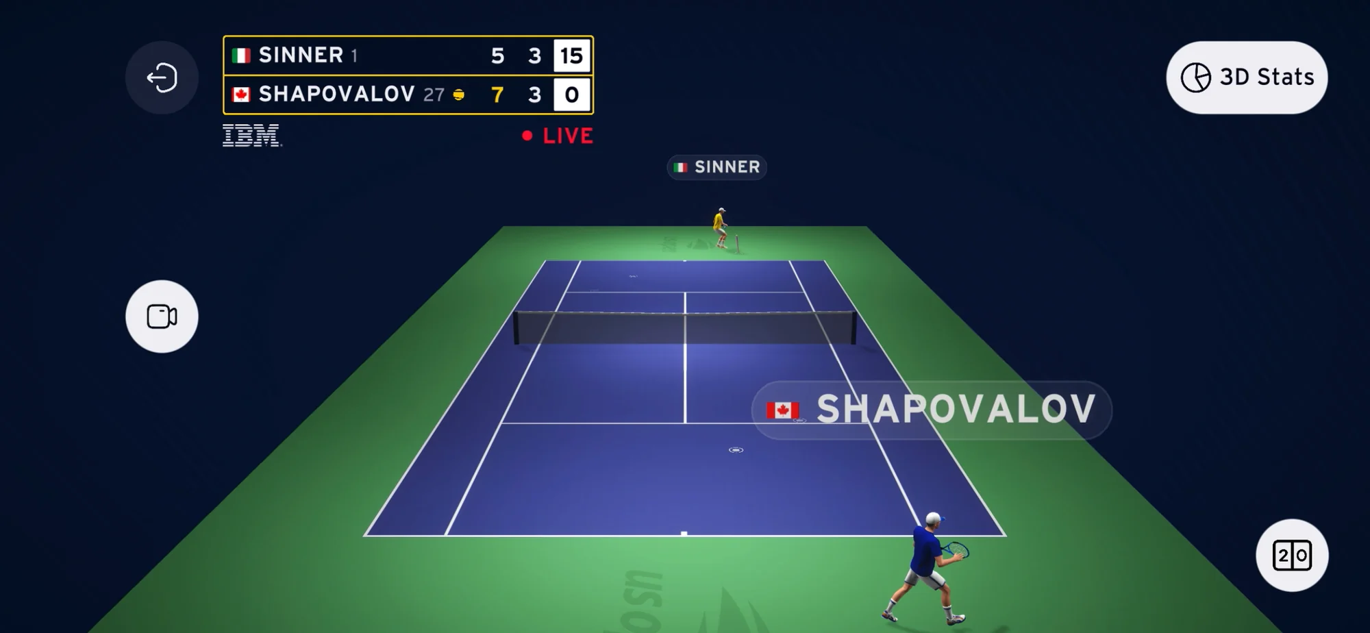
Presets over free camera
Decided on time-to-a-good-angle, not on how much control we could offer.
— %
Angle switching, filters and set selectors were all adopted on all three platforms. The interaction model translated without degrading.
- Same control layout on Quest, phone and desktop
- No platform-specific onboarding needed
In-app analytics · 2025 & 2026 tournaments
À compléter — le chiffre d'adoption
Le taux d'utilisation des vues prédéfinies (ou du changement d'angle) par session, si possible par plateforme. C'est le chiffre qui remplace « healthy adoption ».
Decision 02
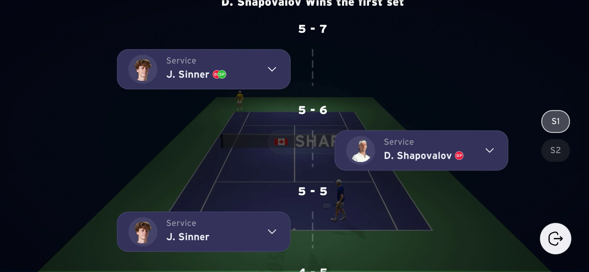
The timeline is navigation, not a replay mode
Tennis is built out of discrete points. The way around the match should be built the same way.
90%+
of all sessions happened during live matches. The timeline is what let fans rewind without abandoning the live feed.
- Fans move between live and the point that just happened
- Leaving live to replay it would have cost them the next one
In-app analytics · 597K sessions
Outcome
What actually happened
- 323K
- Total users
- 597K
- Total sessions
- 30%
- Retention
- 2×
- Year-on-year growth
In-app analytics · 2025 and 2026 tournaments · ESPN & Immersiv.io
90%+ of sessions happened during live matches. That settled the product’s identity: a live companion, not a replay library. 30% retention on an event-based app meant fans came back for the next match.
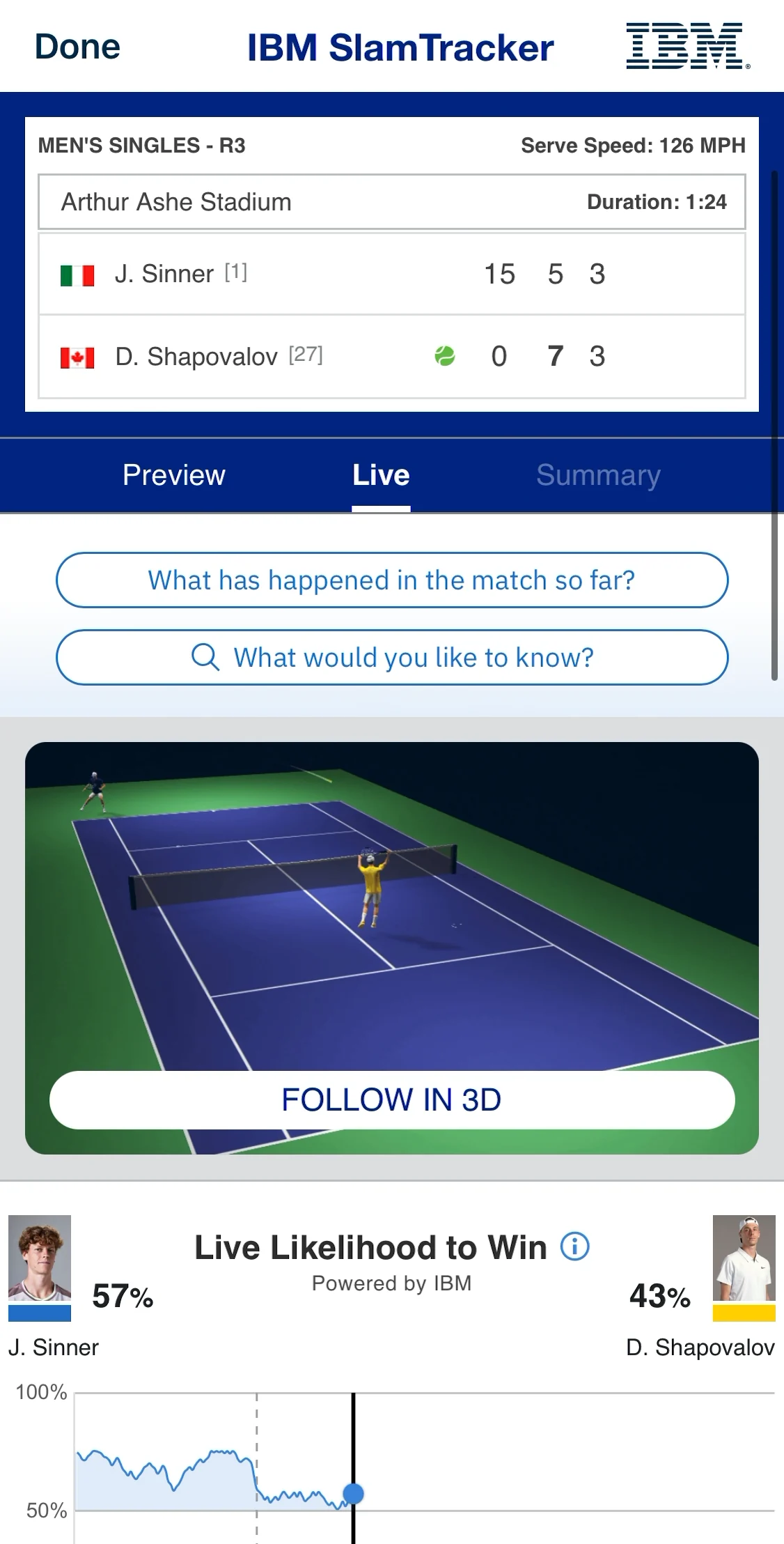
“New feature on the US Open app! This is pretty cool if you ask me.”
“To go back and see where that ball landed and see the trajectory of the ball, it’s a great tool.”
À compléter — un retour client
Une phrase d'ESPN, de l'USTA ou de Meta, avec le nom et le rôle. C'est la seule preuve externe qui manque.
Read-out
What worked, and what didn’t
What worked
- Preset views carried the whole navigation model, on every platform
- The timeline was used live, not after the match
- Fans returned for the next match: 30% retention on an event app
À compléter : un ratio par ligne (adoption des presets, part des sessions qui ouvrent la timeline).
What didn’t
Replay usage was low, and it was an affordance failure, not a content one.
- Timeline points gave no visual signal they were interactive
- Replaying one point took up to three interactions
- Desktop beat mobile, because hover was the only affordance, and touch has no hover
- No onboarding to guide the first attempt
We shipped a feature that was effectively invisible, and found it in analytics rather than in testing. Low usage was never a signal of low interest.
Iteration
What we changed
01
Timeline points carried no click affordance. Fans didn’t know they were interactive.
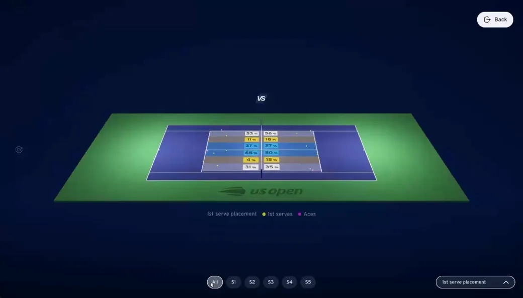
Tapping a point plays the replay inline, with an explicit interactive state.
02
Up to three interactions to replay a single point.
One tap, straight from the timeline.
03
Desktop hover was the only guidance. Touch had no equivalent.
Contextual prompt the first time the timeline is opened.
À compléter — livré ou proposé ?
Ces trois correctifs sont-ils partis dans l'édition 2026 ? Si oui : les écrans avant/après, et le chiffre d'usage du replay après correction. Si non : on étiquette « V2 proposée », ce qui reste honnête et se défend en entretien.
What’s next
Where this goes
A designed post-match mode
Curated 3D highlights instead of asking fans to scrub a whole match. Low post-game usage partly reflects that nothing was designed for that context.
Pre-match surfacing
Fans don’t open the app until play starts, which compresses discovery to zero. Push and a pre-match state buy that window back.
My part
Who did what
I owned
The interaction model across the three platforms: preset system, timeline navigation, stats layout, and the specs handed to engineering.
Others owned
Real-time data and 3D tracking, app integration on ESPN’s side, brand and editorial.
À valider — le partage réel
Corrige ces deux colonnes : c'est le bloc que les cas d'élèves n'ont jamais, et celui qu'un recruteur lit pour savoir ce que tu as fait toi.