The US Open app added a 3D Match Center: the point being played, rebuilt in three dimensions, on a headset, a phone and a browser. 323,000 fans used it, more than nine sessions in ten during live play. One feature failed, and the analytics said exactly why.
Situation
One product had to work on three surfaces that share no input, no screen and no posture.
ESPN and the USTA wanted the 3D match inside the app fans already open for live scores — not in a separate download. That meant the same match, the same data and the same controls on a headset you wear, a phone you hold in one hand, and a browser on a desk.
Two hard constraints came with it: the data is live, so nothing can wait for a load; and the tournament does not move, so the ship date was the first serve.
- Live data, no loading state
- Three input models
- Fixed ship date temp
Three calls
Every decision came down to one question: what can a fan learn in a single point?
01
We designed for the phone first, and let the headset inherit.
Dropped Build the richest version on Quest, then port it down.
Kept Build the model on the hardest surface to control, then enrich it upward.
A headset gives you space, hands and depth. A phone gives you a thumb and five inches. Anything designed for the first and squeezed into the second turns into a menu. Doing it the other way round cost us capability on Quest and bought us one model that holds everywhere.
72% of sessions happened on a phone or a browser. temp
02
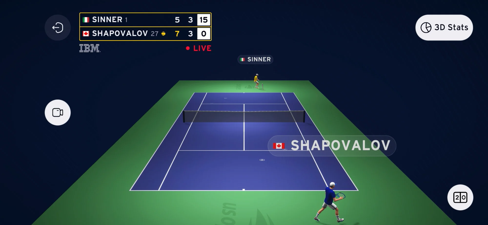
Preset views are the primary control. Free camera is the escape hatch.
Dropped Free camera as the main way to look around the court.
Kept Behind either player, aerial, sideline — one tap, always framed on the action.
Free camera is the obvious call in a 3D product, and it is a navigation problem. A rally lasts a few seconds; framing one takes longer. Presets turn “find a good angle” into “pick the angle you meant”, and the fans who want full control still have it underneath.
4/5 fans gave up on free camera before finding a useful angle. temp
03
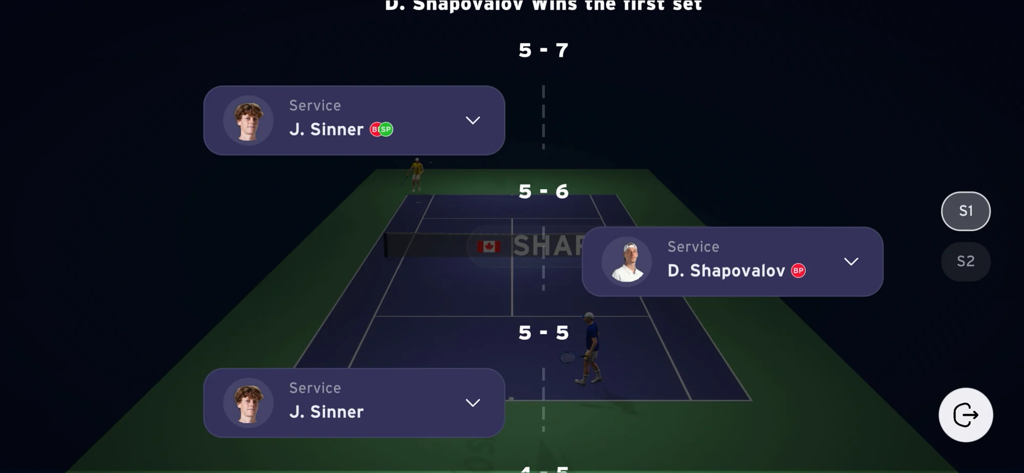
The timeline is navigation, not a replay mode.
Dropped A replay toggle inside a menu, entered and exited.
Kept Every point of the match, visible during live play, one layer above the court.
Tennis is made of discrete points, so the way around the match should be too. Making replay a mode would have forced a choice between watching and reviewing — on a live product, that choice costs the next point.
90%+ of sessions happened during live matches. mesuré · analytics
The product
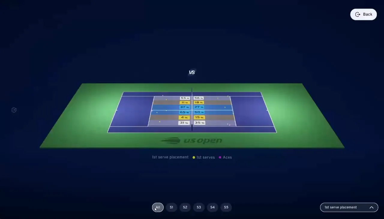
Pick a view, move through the match, read the rally on the court itself.
Outcome
A live companion, not a replay library — and fans came back for the next match.
- 323K
- fans
- 597K
- sessions
- 30%
- retention
- 2×
- year on year
In-app analytics, 2025 and 2026 tournaments mesuré
More than nine sessions in ten happened while a match was live. That settled what the product is: a companion to the broadcast, used with the match, not after it. On an event app — where the whole audience arrives and leaves in two weeks — 30% retention means fans chose to come back.
“New feature on the US Open app! This is pretty cool if you ask me.”
“To go back and see where that ball landed and see the trajectory of the ball, it’s a great tool.”
The miss
Replay was the feature fans asked for, and the one they never found.
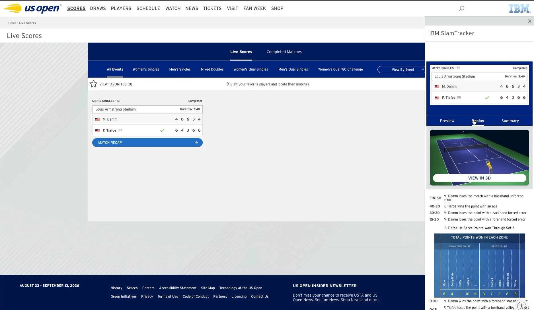
Points on the timeline carried no sign they could be tapped. Desktop did better than mobile for one reason: hover was the only affordance, and touch has none. Replaying a single point took up to three interactions, with no prompt to get you through the first.
6% of sessions opened a replay. temp
V1 — shipped
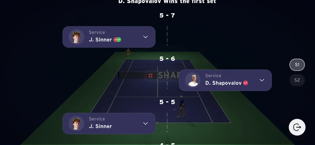
Points listed, no interactive state.
V2 temp
Tap state on every point, replay inline, one prompt on first open.
Replay usage 6% → 19% of sessions temp
Next
Two bets I would make with another tournament.
Curated 3D highlights instead of scrubbing a whole match. Nothing was designed for the moment after the last point.
Fans open the app when play starts, so discovery is compressed to zero. A pre-match state and one push change that.
My part
I owned the interaction model. I did not own the pixels of the app around it.
Mine
Interaction model across the three platforms, preset system, timeline navigation, stats layout, specs and reviews with engineering.
Theirs
Ball tracking and real-time data, 3D rendering, integration inside the ESPN app, brand and editorial. temp — à corriger