Three platforms, one interaction model
323K users. One interaction system across Quest, mobile and web. And one feature that failed, with data that told us exactly why.
- Role
- Lead XR Interaction Designer
- Timeline
- 2025 and 2026 tournaments
- Clients
- ESPN & USTA
- Partners
- Meta, IBM, Immersiv.io
- Platforms
- Quest / iOS & Android / Web
The tension
The obvious move was to build for the headset first
The obvious move
Design the richest experience on Quest, then port it down to mobile and web.
What we did
We inverted it. Quest was the headline, but mobile and web were where the users would actually be. So the interaction model was designed for the weakest input surface first, then enriched upward.
Decision 01
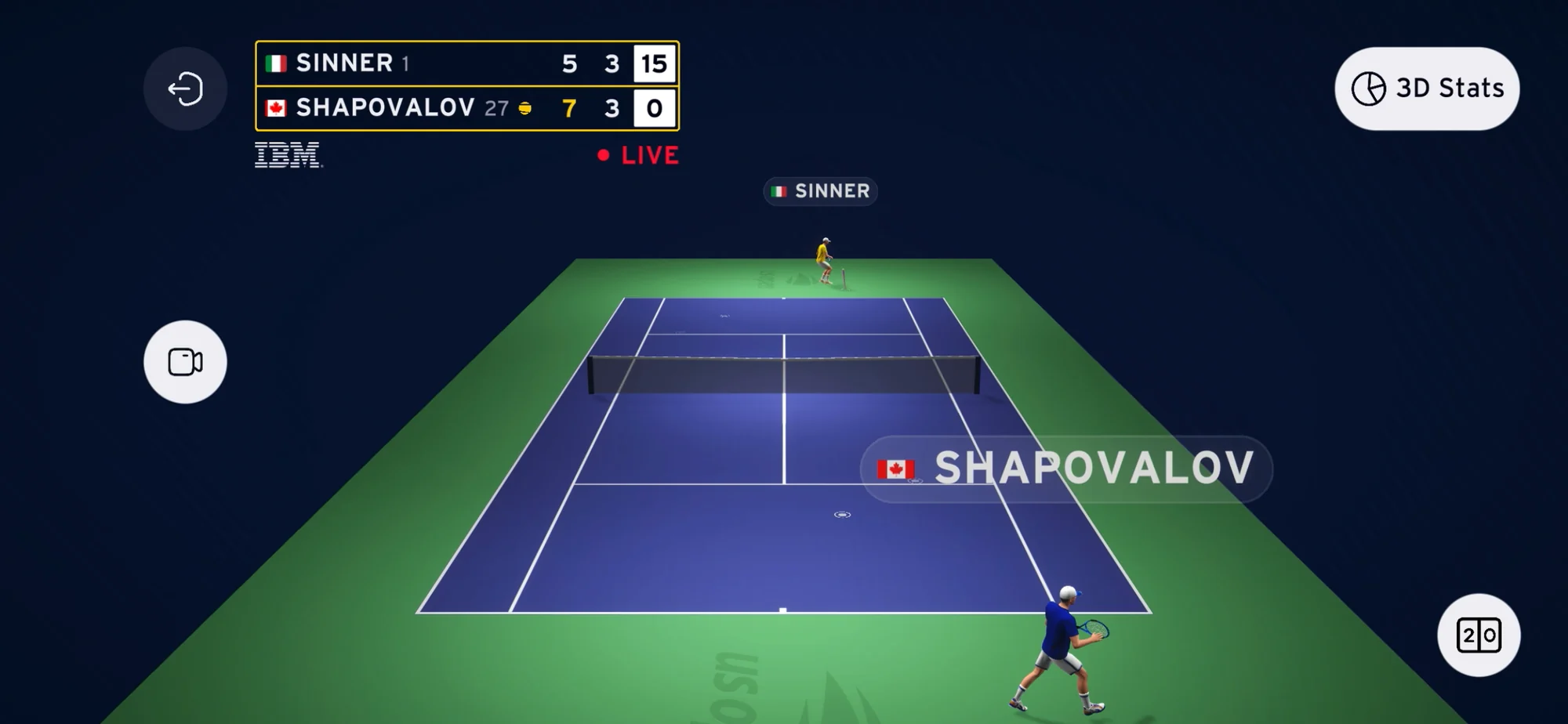
Presets over free camera
Free camera in a 3D sports experience is the obvious call. It is also a navigation problem.
Most fans don’t know where to look. The effort of finding a good angle costs them the moment they wanted to see: the rally is over by the time they’ve framed it.
We shipped preset views as the primary control: behind each player, aerial, sideline. One tap to a meaningful perspective, always oriented to the action. Free camera stayed available underneath for anyone who wanted it.
Evidence
Angle switching, filters and set selectors all showed healthy adoption across all three platforms. The interaction model translated without degrading.
Decision 02
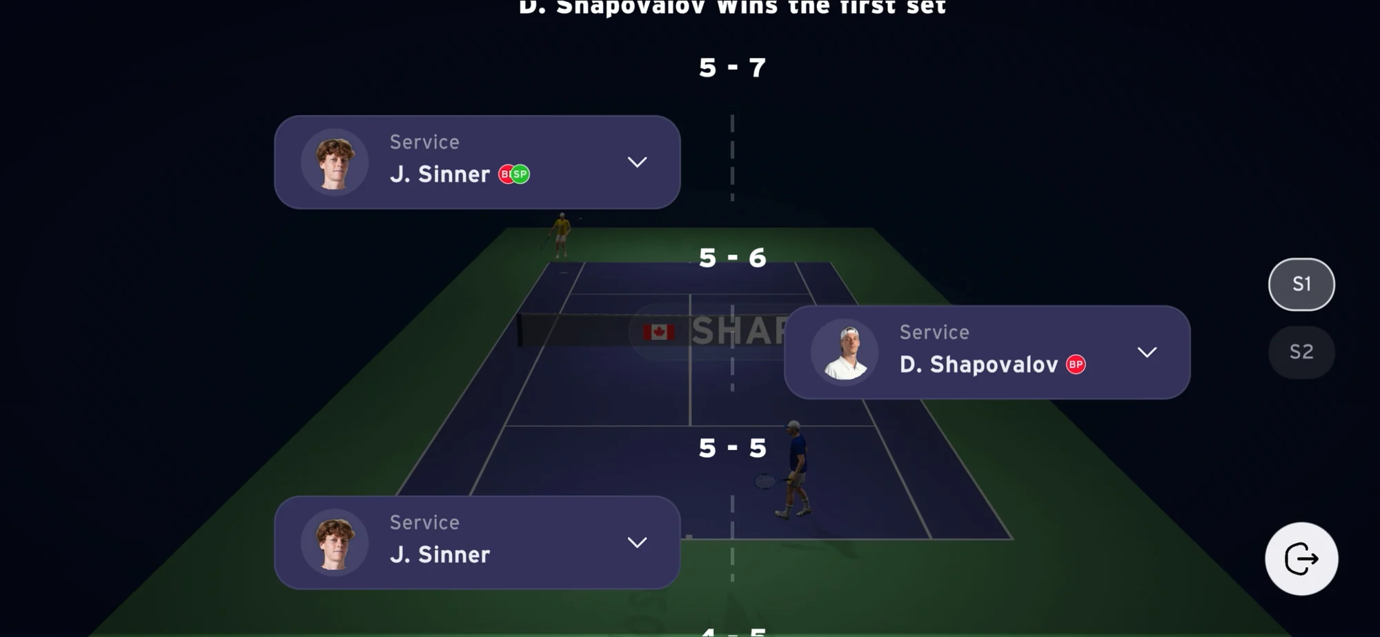
Timeline as first-class navigation
The timeline could have been a replay toggle buried in a menu. That is where it usually lives.
We made it the primary navigation layer instead: visible by default, available during live play, never a mode you have to enter.
The bet: fans want to move between live and the moment that just happened without leaving the live context. Tennis is built out of discrete points; the timeline should be too.
Evidence
90%+ of all sessions happened during live matches. The timeline was what let fans rewind without abandoning the live feed.
Outcome
What actually happened
- 323K
- Total users
- 597K
- Total sessions
- 30%
- Retention
- 2×
- YoY growth
90%+ of sessions happened during live matches. That settled the product’s identity: a live companion, not a replay library. 30% retention on an event-based app meant fans came back for the next match.
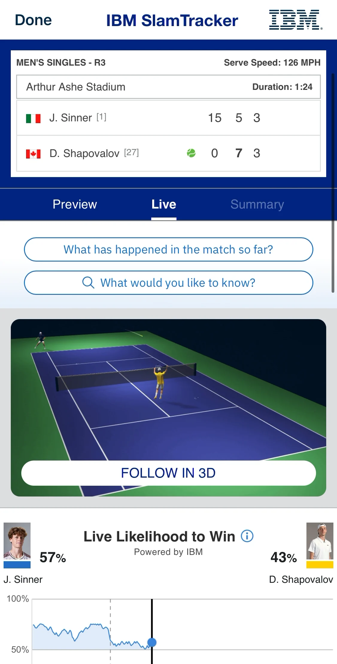
“New feature on the US Open app! This is pretty cool if you ask me.”
“To go back and see where that ball landed and see the trajectory of the ball, it’s a great tool.”
The honest part
What broke
Replay usage was low, and it was an affordance failure, not a content one.
- Timeline points gave no visual signal they were interactive
- Replaying a single point took up to three interactions
- Desktop significantly outperformed mobile, because hover was the only real affordance, and hover doesn’t exist on touch
- No onboarding to guide the first attempt
We shipped a feature that was effectively invisible, and found it in analytics rather than in testing. Low usage was never a signal of low interest.
Timeline points carry no click affordance: users don’t know they’re interactive
Tap-on-point triggers replay inline, with an explicit interactive state
Up to three interactions to replay one point
One tap, directly from the timeline
Desktop hover is the only guidance, with nothing equivalent on mobile
Contextual prompt on first timeline open
What’s next
Where this goes
Simplify replay
Rebuild the timeline so tapping a point triggers replay directly, with contextual onboarding on first open. The feature works. It just isn’t visible.
A real post-match mode
Curated 3D highlights instead of asking fans to scrub a full match. Low post-game usage partly reflects that nothing was designed for that context.
Pre-match surfacing
Fans don’t open the app until the match starts, which compresses discovery to zero. Push and a pre-match state buy back the window.